
- cross-posted to:
- [email protected]
- cross-posted to:
- [email protected]
According to the filing, Lipnik has been fired from Apple “for failing to follow Apple’s policies designed to protect its confidential information, including development devices and unreleased software and features.” The filing also accuses Lipnik of failing to report “multiple prior breaches” to Apple.
When you sign an NDA (non-disclosure agreement), you’d best protect the secrets. Then again, the guy who left an iPhone 4 in a bar didn’t lose his job. Wonder what the differences are between them.
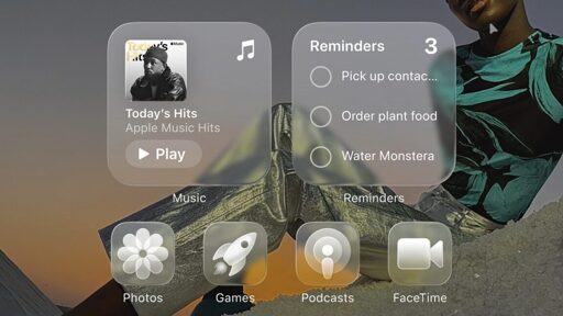
Just to clarify something, because I think the majority of people here only know what iOS 26 looks like from the thumbnail. Below is an actual screenshot of the iOS 26 beta running on my phone.
Just like Android, things are customisable and the icons in the thumbnail are the most egregious version of the new visuals. I find it hard to believe anyone will actually use that styling tbh.
Even the non glass icons look terrible, they include some automatic blur being applied.
I agree! But, I also think that might be some weirdness with how the system treats lighting on the normal icons compared to ones updated with their new materials in mind.
Almost all of the 3rd party app icons I have are various levels of blurry but the system icons seem fine.
Any level of UI element transparency is hard nope from me. Based on your screenshot, it looks like Apple was listening, on that front.