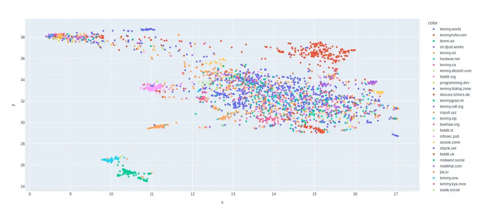
This is my first try at creating a map of lemmy. I based it on the overlap of commentors that visited certain communities.
I only used communities that were on the top 35 active instances for the past month and limited the comments to go back to a maximum of August 1 2024 (sometimes shorter if I got an invalid response.)
I scaled it so it was based on percentage of comments made by a commentor in that community.
Here is the code for the crawler and data that was used to make the map:


What is [email protected] doing over with the red dots 🤔
Either the people in [email protected] are pretty horny or its an artifact of the dimensionality reduction and means nothing.
Edit: Actually it could also be that it just didn’t collect enough data on that community and the most recent person was also active in nsfw communities. I was only able to get back 14ish days in the data for lemmy.world. They produce way to many comments and I got kicked out early.
Anti Commercial-AI license (CC BY-NC-SA 4.0)
deleted by creator
Long distances actually don’t really mean much it can’t be guaranteed that they actually correlate to much. It is mostly the local groups that are conserved and a bit of the global structure.
Anti Commercial-AI license (CC BY-NC-SA 4.0)
This community has only two posts and a few comments. The algorithm has very few information on such tiny communities.
It would probably be useful to only include communities with a minimum amount of interaction to avoid such outliers.