We reached the point (some time ago) where the save icon being a floppy disk makes absolutely no sense to anyone born after a certain time. We could choose a more modern media format and use an icon of that instead, but we would run into the same problem once that media becomes obsolete.
What is a good icon for the function of saving something that can easily be understood by anyone regardless of language or the march of time?
Edit: I know it’s not really an answerable question and is hard but the question is what would you come up with if tasks to design an icon. Given the constraints of the question, what are your best shots at coming up with something that fills the requirements and why do you thing it would work?
Floppy disk. Fight me.
Agreed. It’s the tried and true icon.
It’s like on discord, what’s the symbol to make a call? An old school telephone handset. People know what it means. It’s a universal symbol
People have stopped recognizing it as a disk (which is good because that meaning was always pretty confusing in terms of saving vs loading) it is now the save symbol and will continue to be the save symbol centuries after the last floppy disk has crumbled into ash.
Similarly, the folder icon has now been enshrined as load.
Why is the disk save and the folder load? It’s completely fucking arbitrary, both worked just as well for each context. But someone somewhere (probably in the MSFT internationalization and standards team tbh) made that choice once and thus it is that forever.
Yeah there is no reason at this point to change it as we just teach people that the floppy disk means save. I was wondering if we could come up with something that the user, at a glance, would generally identify as saving. What would that glyph look like. In other words, the arbitrary and established icon is what it is but with hindsight and thinking ahead what would be a better icon we could design. One that would convey “save” to the most people the first time they see it.
The act of loading necessitates a selection, so the folder makes more sense.
No more so than saving. Either saving and loading use free filesystem browsing interfaces, slots that are embedded into a single file/non-descreet location on disk, or they save into a limited scope of files/folders on disk. The last system seems to be the most common in modern UX within non-compatible apps with the first system being preferred for apps dealing with common files (like a text editor).
Also, there is a whole thing with Save As vs. Save - though with a new file/profile/whatever Save can often trigger a Save As action.
Most saving is done on files that already exist.
That’s a fair answer. There is nothing saying the floppy disk can’t work. By sticking with a symbol that has no actual bearing on function (from the perspective of the future people) you’ve abstracted the concept of saving away from natural language. However, you still place a computational burden on those future people/aliens/whatever where they need to be taught what that icon means.
It’s a floppy disk. Which is the universal icon for saving, the same way a red light is a universal symbol for “stop”.
You underestimate the power of arbitrary symbols. Welcome to all of human semiotics.
No I get that but I’m asking that given what we know about symbols and how we process information, what would be a better icon that can indicate save without having to be taught? There is clearly no right answer here but is it even possible to create something that would work? Things like rain or clouds we can do because there we can see examples. Is there anything that indicates saving we could come up with?
Probably not. We use a kebab or a hamburger to mean “tap here for a menu” for some reason
The symbol is meant to represent line items on a menu. It’s referred to as “hamburger” because it’s whimsical, Leland.
This little exchange makes my point beautifully.
But we did. We used a 3 1/2 floppy disk, which only made sense referentially very briefly (after it took over from 5 1/4 floppies, but before all the saving was handled by a hard drive), and then that became the convention.
You’re asking if there’s a referential equivalent you could do now. You could do a little cloud or whatever else, but it wouldn’t be any less “taught”, because the teaching happens, like any other UI iconography, by having a bit of text next to it in a menu or a tooltip and then it becoming an arbitrary icon that just means that thing.
The point of the icon referencing something (star for bookmarks, a down arrow into a little box for download and a puzzle piece for extensions in my Firefox bar right now) is to make it easier to remember later because there is some context that connects the visual to the functionality. It’s not necessarily to make it so that I don’t have to learn what the functionality is in the first place and just intuit from the visual. That just happens because I have decades of knowledge about what the functionality in browser is supposed to be and what the arbitrary convention for certain functionality across other apps ends up being.
Your difficulty here is the qualifier “better”. We can create a different icon. A more modern icon. A cooler icon. But there is not a better icon, not until fewer people understand the floppy means save than those who have no idea what it is. And because it’s self-reinforcing (“the save icon is a floppy disk because floppy means save”), that’s not likely in my estimation.
We’ll see the problem with this is symbols are inherently contextual to culture
There is no correct icon, the floppy disk is at least popular enough to be used essentially forever
Alternatives would be making an SVG that mocks a HDD, or an open drawer with an arrow pointing in
For long term (1000 years) I think an open drawer is best especially with an arrow. It suggests putting something in, loading can be the inverse
So people used to store stuff in physical space like drawers? You mean if they needed something they had to physically go there and get it out of something else? Man, early humans were crazy.
Probably something like this. Seems self-explanatory to me at least.

I assumed it’s sinister for left turn but then I got confused why L was turning right (is L supposed to be for leave?)
Save and Load (?)
For English speakers I could see this working, but I imagine the letters would have to change per language which would be suboptimal.
don’t change the floppy :( once nobody speaks of it, it truly dies
Not quite dead yet. This seismic survey ship I was 9n fairly recently… we had generated the navigational data, and needed to feed it into the ships autopilot. This was done via floppy.
Yes, it was a relatively old ship (late 90’s, I think), but there are plenty older ones around. And even when refurbishing a ship, they often leave the autopilot alone.
Yeah I probably should have qualified that with, “unless you’re a municipal/city/state transportation system or in maritime.”
Or pretty much anywhere in the manufacturing sector.
Plenty of products you use on a daily basis, especially processed foods, are being cranked out on equipment controlled by PLC’s from the 1980’s or earlier.
Don’t worry, your wife still will.
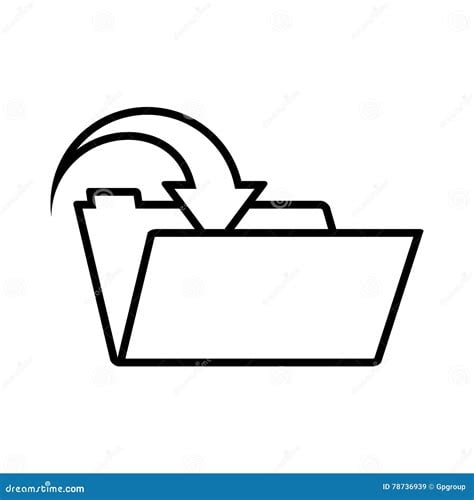
Assuming people still know what a folder is, the most obvious would be a folder with an arrow going into it, like:
 or
or

I know I’m wrong for thinking this but it looks too much like open to me.
“I have updated the save icon from a floppy disk to a CD-ROM.”
I’ve noticed youngsters where I work sometimes no longer know what “saving a document is”, as they only know google doc style sync.
So I’d go with a send button: send to harddrive. Usually represented with an triangle/arrow.
Send/share buttons are already a fucking mess though
I think that’s more of a UX issue than an issue of iconography, though. Could-synched stuff synchs in the background, so there’s just no interaction involved.
I don’t know how far down that road it’ll go, but I wonder if eventually the concept of “checkpointing” in games becomes more frequent than old document saving and that’s how we think about version control going forward.
Just keep using the disk icon.
Just because the original reference is outdated doesn’t mean it’s useless; the symbolism carries over. Changing it to the sake of future-proofing makes no sense because everybody already understands it now, and that knowledge will carry forward into the future. It has become the standard, even if it makes no sense, it even if it never made sense.
Horsepower is still used to refer to engine strength, even though nobody uses horses. Qwerty is still the keyboard default even though it’s not optional, because typewriters had settled on that standard ages ago. The human skull symbol is commonly used as a shorthand to indicate a substance is poisonous, because it has been for a long time. Even the term “dial” when referring to phone calls is still commonly used, even though nobody but your great-grandmother still even owns a rotary phone.
Tldr; If it ain’t broke, don’t fix it.
What are you doing when you save something? You’re keeping it in its current state, held in stasis, to be retrieved later. Maybe using freezing imagery (like a snowflake) could get that concept across, and it would retain its meaning over time.
Another way to think of saving is storage - putting something in a convenient location for later access. A safe might be a useful image, but it implies security. Other types of storage devices seem too likely to change with time. Maybe a pocket? If there was a way to graphically represent putting something in your pocket that would be a fairly universal and durable image.
Your second sentence makes me think an equal sign would be appropriate.
An equation does not need to be identical on both sides, just equal in value.
Also both sides don’t need to be unchanged. In fact mostly they don’t.
= does not convey persistence in any way for me (& I guess most people).
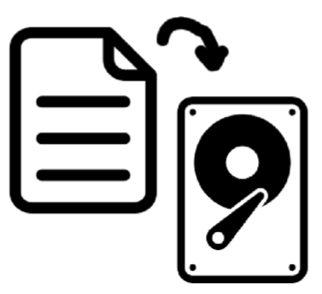
How about something like that? Symbolises data to device.
deleted by creator
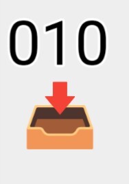
Yeah, I just used what icon was handy. I mean if you were to do a more serious attempt,I’d draw it more like a concrete box, myself. Or more specifically concrete slots that line up with the numbers, driving home the point that it is a more permanent solution.
This is what I was thinking of, but no binary and just a square cardboard box with the flaps open.
Just an arrow pointing into a box.
I think this assumes no knowledge and transcends culture and tech.
Maybe it’s just me but this looks like we’re putting it somewhere to forget. Like junk lol
We should just start manufacturing NVME drives to look like floppy disks.
Or just the hard drive by itself. Is a platter drive old fashioned these days?
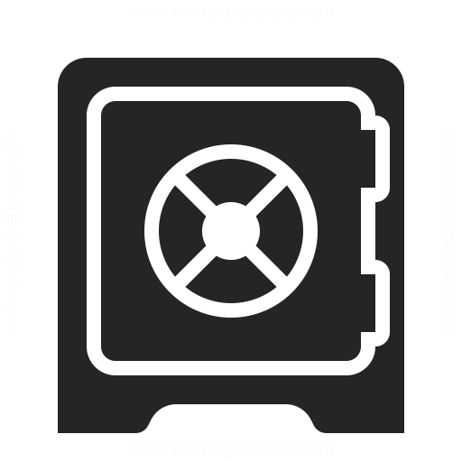
Also a safe would be a decent choice.
Why do you want to move a piece of paper onto an old style record player?
I mean I’m in my 40s now, but we still have spread sheets, Word documents, and web pages don’t we?
And I think everyone still knows hard drives are at least a thing? I can buy people in their early 30 or under never used a floppy, but we’ve all used some form of hard disk.
Also, I noticed no argument of the safe suggestion, and I hazard a guess many fewer of us have used an actual safe than a hard disk, especially a safe with a big swinging lock, but I think the majority could get the intent of putting something in a safe. Perhaps an open safe with an arrow going in if we want to be grandiose about it? 😉
A safe would make more sense for an encrypted partition or directory
You’re asking for an abstract indicator of a concept. You might as well be trying to draw ‘dignity’.
Everything else will become obsolete with time, and that’s not necessarily a bad thing. We have countless icons that have long since been separated from their original meanings. The need for it to be intuitive is when the concept is new, not as it changes.
Yeah you’re right, but I think it will be interesting to hear what people come up with. It’s similar to the nuclear waste warnings. Wikipedia Nuclear Waste Warnings